November 7, 2026
Wedding Trends for 2027: What Couples Are Actually Choosing
Every year brings a fresh round of "the" wedding trends, and most of them are gone by the time the invitations go out. The ones worth paying attention to for 2027 are different: they are already showing up at real weddings, in stationers' order books and photographers' galleries, and they share one quality — they make the day feel considered rather than decorated. Here are the five that matter, and how to use them without turning your wedding into a trend board.
1. Serif type takes the lead
The biggest shift in wedding paper this year is typographic. Clean, high-contrast serif lettering for names — the kind you would see on a book cover — has taken over from script and calligraphy as the default. Script has not disappeared, but it has moved into a supporting role: a small line here, a monogram there. The practical upshot is that names are easier to read across a room, place cards photograph better, and the whole suite looks calm instead of busy. If you are choosing fonts, pick one serif you love for names and one plain sans for the details, and stop there.
2. The colors: sage and dusty rose, grounded and warm
The palettes couples keep coming back to for 2027 are warm and grounded: sage with terracotta, dusty rose with cream, burgundy with gold. Sage has moved from trend to near-classic at this point — it photographs well in every season and flatters skin tones in a way brighter greens never did. Dusty rose does the same work on the warm side. The useful rule is to pick one grounded color as your anchor and let the second one stay quiet. Two loud colors fight; one loud color and one soft one agree.
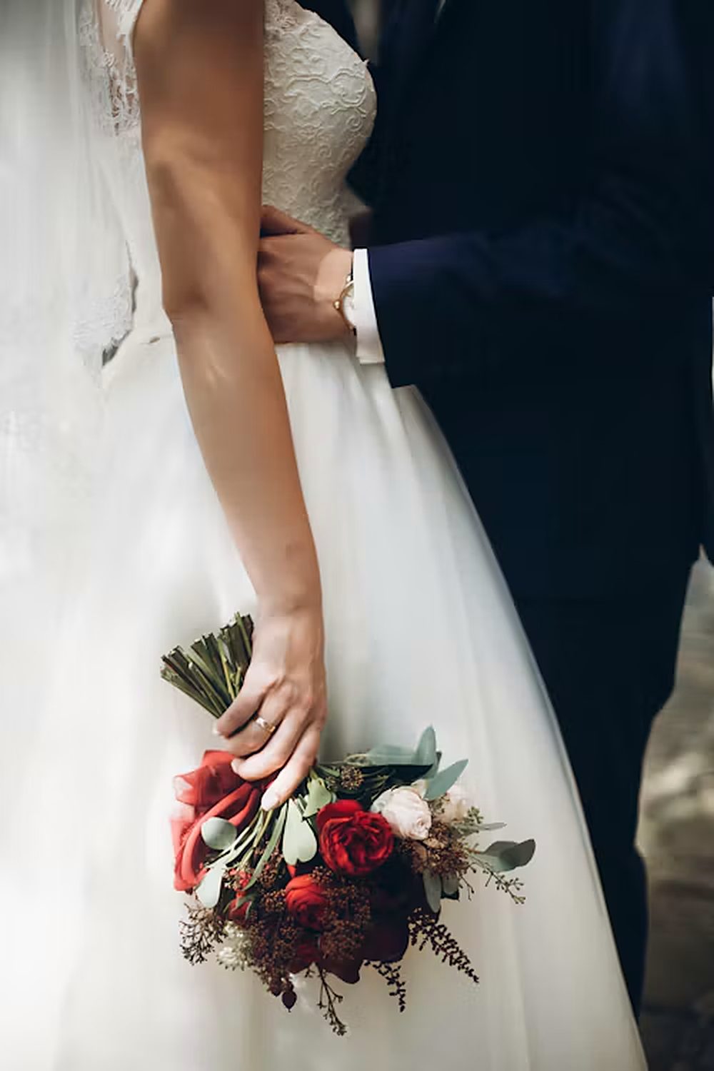
3. One matching suite, from invitation to place card
The day-of paper — menus, place cards, table numbers, the seating chart — is now treated as a continuation of the invitation suite, not a separate pile of admin. Guests spend the whole evening looking at these pieces, so when they share one design, the room feels finished in a way no single centerpiece achieves. This is the easiest trend to use: decide the design once, when you choose invitations, and carry it through. A seating chart that becomes matching place cards is the whole idea in one move.
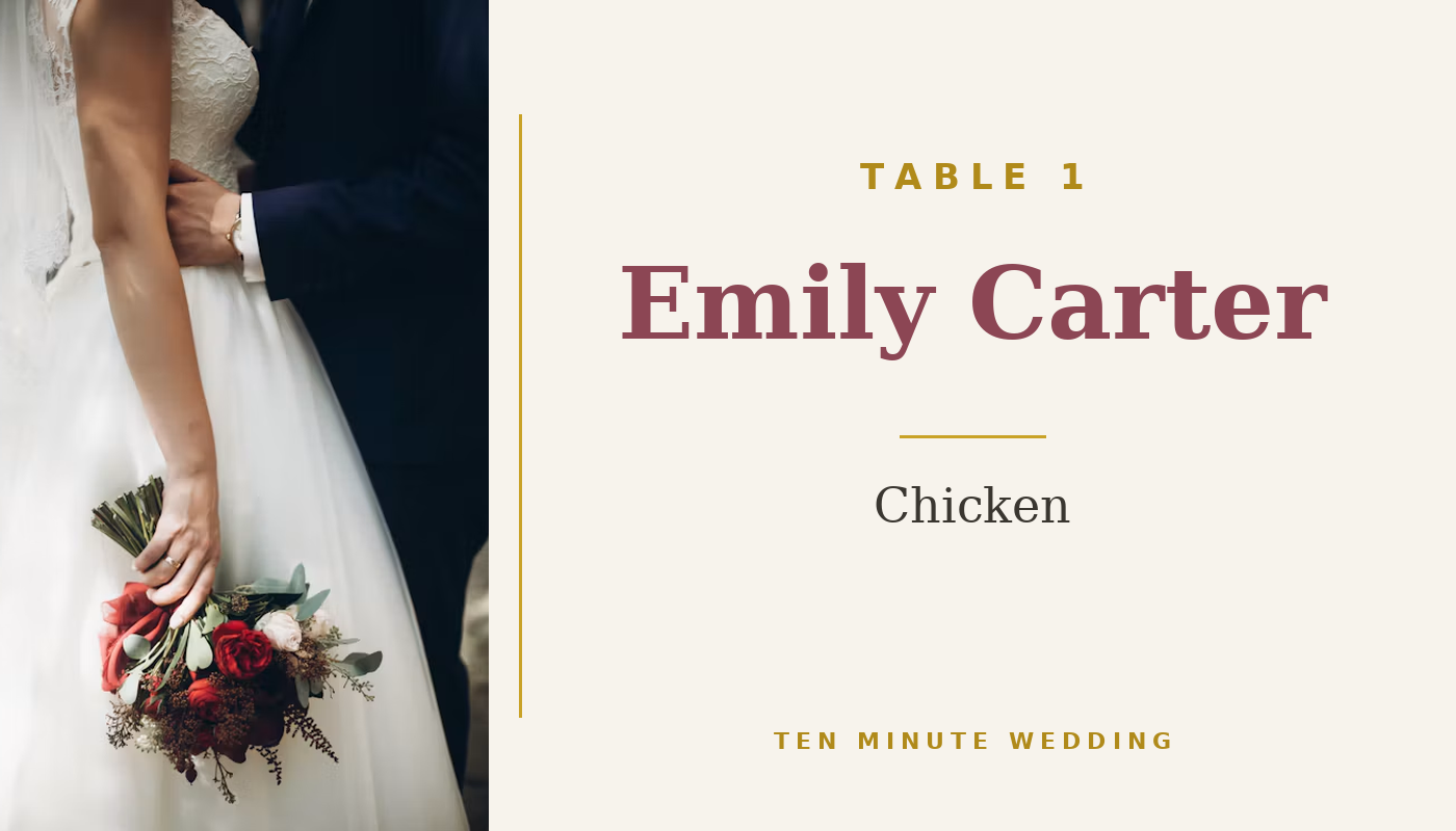
4. Paper you can feel
The luxury cue for 2027 is texture. Deckled edges, cotton rag, letterpress, embossed numbers, linen-textured card — heavier stock that makes a place card feel chosen rather than printed. You do not need all of it. One textured piece per table — the table number, say — carries the effect, and 65 lb cardstock printed at home gets you most of the way there. If a supplier offers a sample pack, take it: texture is the one thing a screen cannot show you.
5. Personal, guest-first, and the dinner-party table
The last shift is about how the evening feels rather than how it looks. Place cards with a personal note, table names with meaning instead of numbers, and long-table "dinner party" receptions where the room is one conversation instead of twenty islands. A meal choice printed on the card is the small version of the same idea — a guest-first detail that says somebody thought about the person, not just the seat. None of this costs more than the generic version; it costs a little more attention at the planning stage, which is exactly the kind of attention a spreadsheet is good at holding.
How to use these without chasing all five
Trends are useful as a shortlist, not a shopping list. Pick the one or two that fit the wedding you are already planning and ignore the rest. A good test: if a trend would still look right in a photo ten years from now, keep it; if it only looks right this season, let it go. The trends above are also in a one-page 2027 guide — the colors, the paper, and the details — free with the place cards in the shop, to print and keep beside the spreadsheet while you decide.
Plan it in the spreadsheet. The 10-Minute Wedding Planner tracks this for you — budget, guests, vendors, payments, checklist and the day-of timeline in one workbook.
Filed under wedding planning · More from the blog